No Rivals
Glory Days Campaign
A new era of collegiate nostalgia.
A four-collection headwear campaign that reimagined vintage sports culture through a modern editorial lens. From introducing a new product silhouette to directing a multi-channel launch, Glory Days helped push No Rivals beyond traditional fan merchandise and further into fashion and lifestyle.
My Role
Concept, Creative Direction, Product Strategy & Campaign Execution
Disciplines
Campaign Development, Art Direction, Apparel, Photography, Social
Scope
4 Collections / 2 Production Days / 2-Week Rollout
Impact
3 Evergreen Hat Styles / Continued Wholesale & Licensing Use
Year
2025
Industry
Apparel
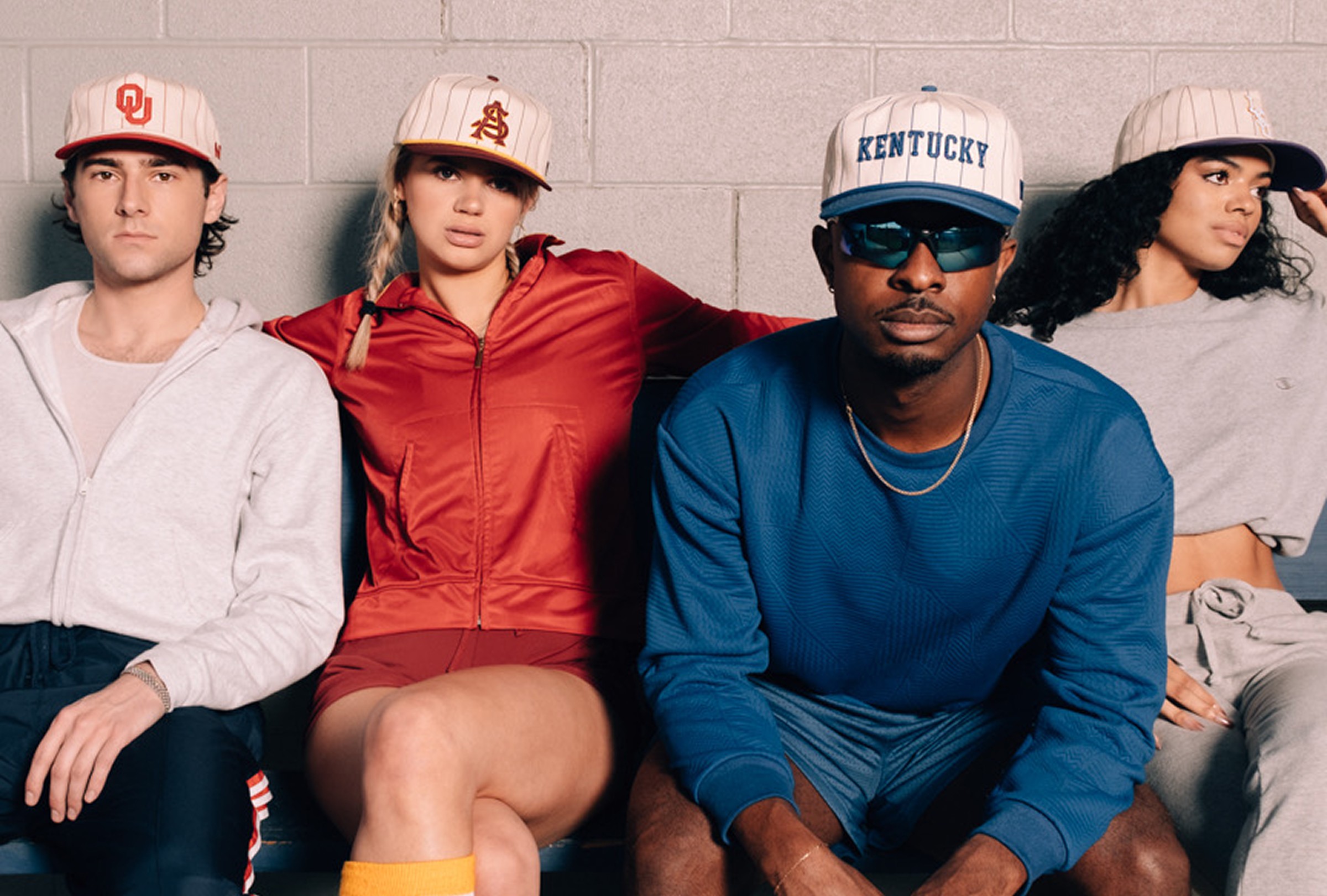
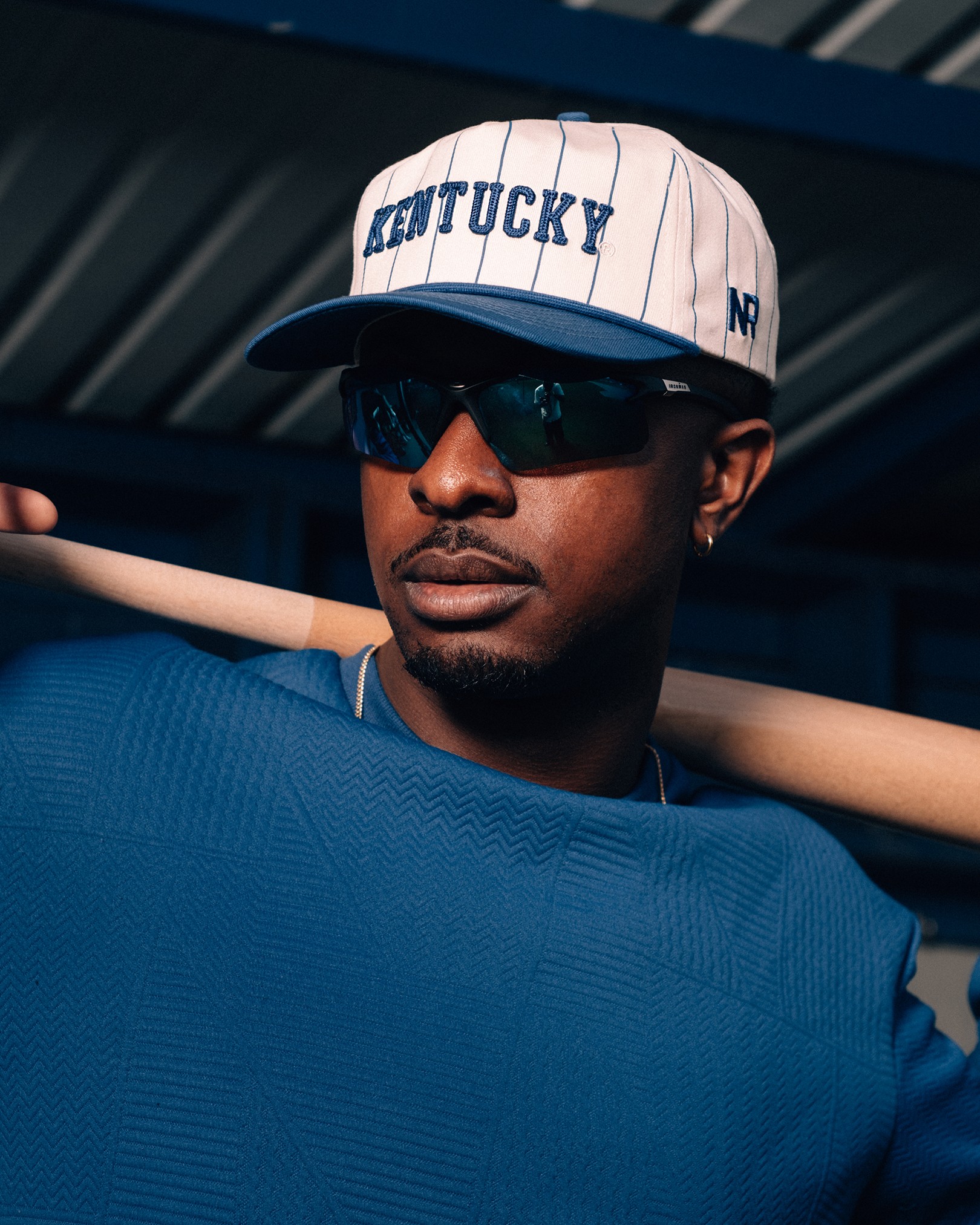
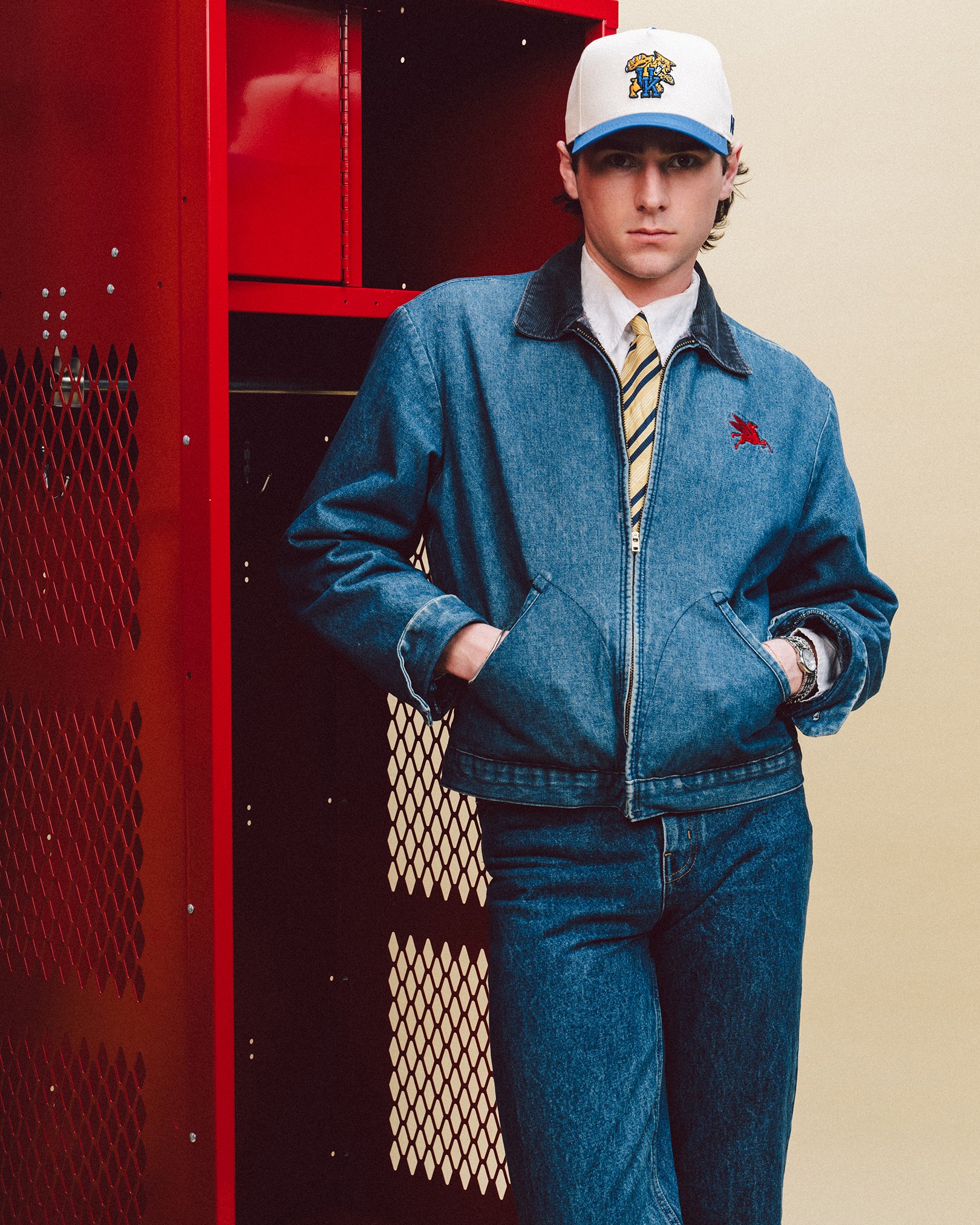
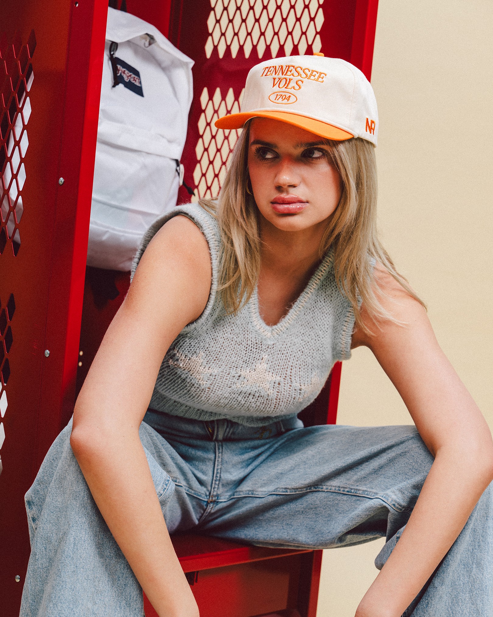
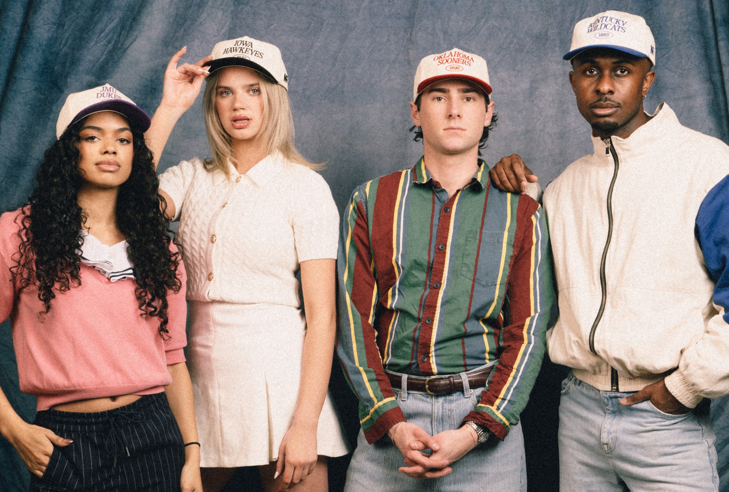
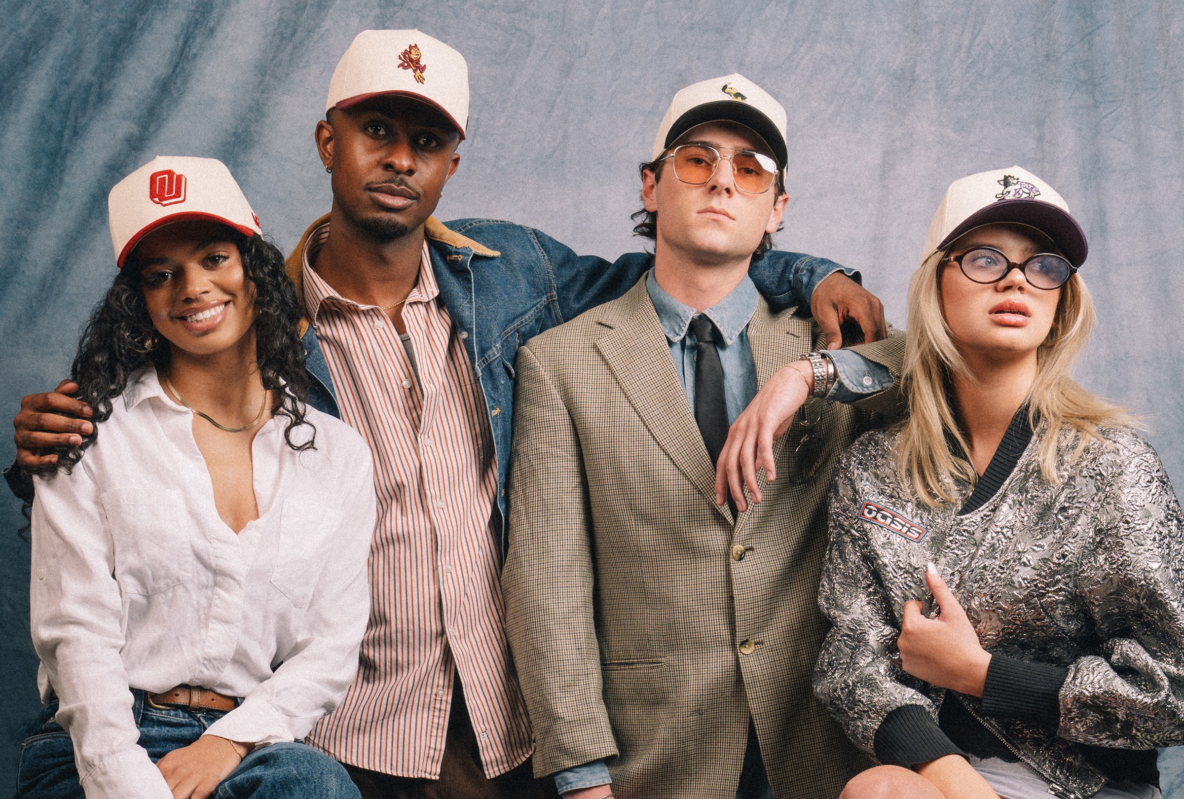
Capturing classic collegiate style from the 70s to the 90s, this collection embraces nostalgia while bridging iconic vintage designs.
The Brief
College sports, without the traditional sports marketing.
No Rivals had established itself around elevated collegiate headwear, but the broader industry still leaned heavily on traditional fan merchandise and predictable sports marketing.
Glory Days was an opportunity to push the brand further into fashion and lifestyle. The goal was to develop four distinct hat collections that celebrated collegiate heritage without relying on the usual imagery of stadiums, athletes, and competition.
Rather than focusing on the game itself, I wanted to capture everything surrounding it: nostalgia, individuality, school pride, and the memories people associate with their younger years.
The Strategy
Make the past feel relevant again.
I developed the Glory Days concept around the way people romanticize the late 1980s and 1990s as the golden years of sports, school, and youth. The name gave us an emotional foundation that could connect product design, photography, styling, and storytelling.
The visual direction drew from high school yearbooks, senior portraits, and vintage sports magazines, but with a more contemporary editorial sensibility.
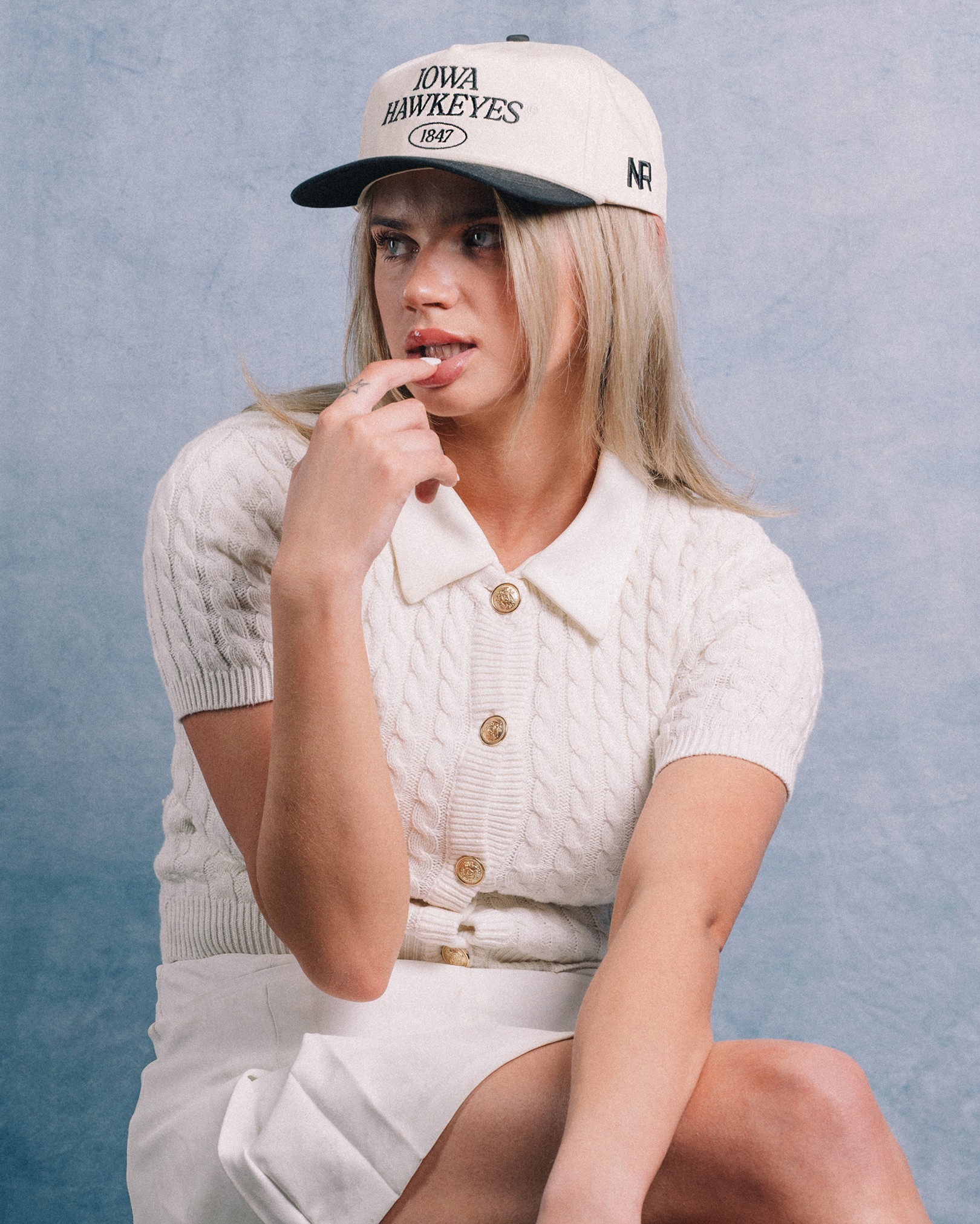
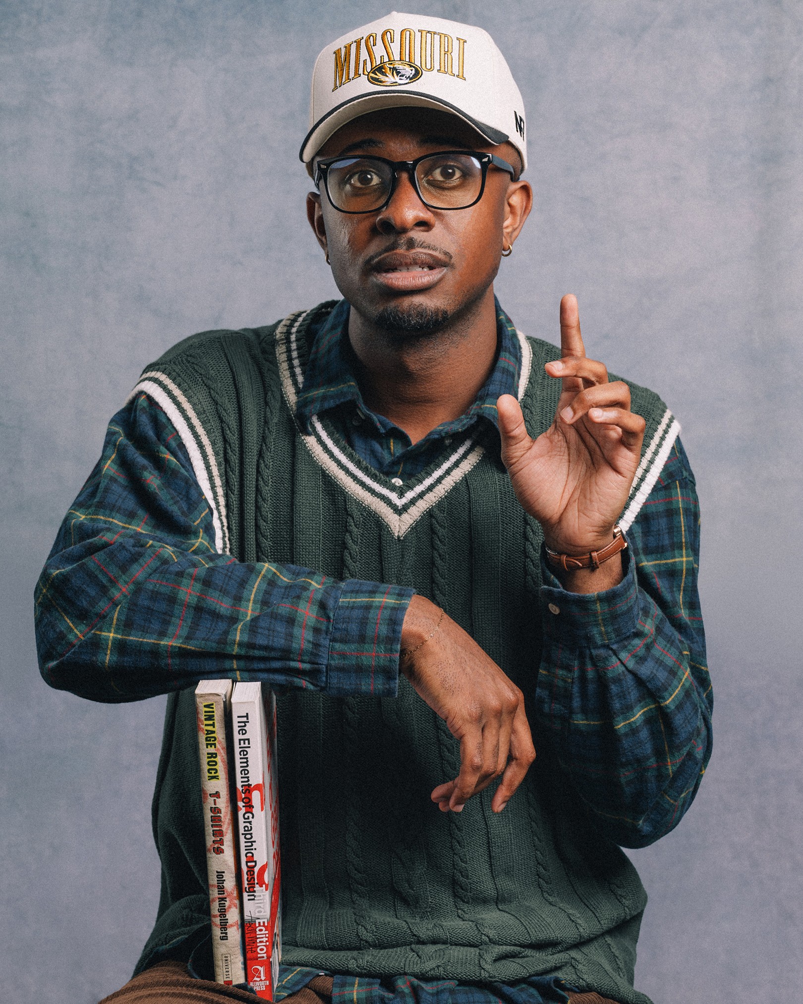
Instead of treating the hats like traditional collegiate merchandise, we positioned them as fashion pieces. The photography focused on personality rather than athletic performance, allowing the collection to feel nostalgic without becoming a costume.
The Decisions
A new silhouette, a different direction for the brand.
One of the most important decisions behind Glory Days happened long before the campaign began.
For over a year, I had been advocating for No Rivals to expand beyond structured headwear and introduce unstructured silhouettes. I believed the softer, more relaxed construction would better connect the brand with contemporary fashion while maintaining its collegiate identity.
Glory Days became the first campaign to fully introduce that direction.
The collection brought together four distinct styles, ranging from relaxed five-panel hats and vintage serif typography to structured retro blocks, heritage logo patches, and pinstripe detailing.
Another deliberate decision was how we translated the creative direction digitally. While the campaign graphics embraced vintage yearbook aesthetics, I designed the website lookbook around a clean, modern editorial photo grid.
The contrast was intentional. We wanted the collection to reference the past without making the brand feel stuck in it.
The Build
Two months of planning. Two days of production. Two weeks to launch.
I led the campaign from concept through rollout, developing the naming, creative strategy, moodboards, shot lists, and overall art direction while coordinating closely with photographer Malcolm Herod.
Production took place across two days in studio and location environments with three models. Each of the four collections needed its own visual personality while still contributing to a cohesive campaign.
Malcolm helped manage production logistics and models while translating the creative direction into photography that felt natural and emotionally driven.
Once the photoshoot wrapped, we had just two weeks until launch.
I handled the website rollout, digital lookbook, email creative, and social graphics, alongside my product design contributions to one of the collections. The campaign also extended into paid advertising and print collateral for events, wholesale, and licensing presentations.
The challenge was moving quickly without losing consistency across the many places customers and partners would encounter the work.
The Impact
A seasonal launch with a much longer shelf life.
Glory Days generated strong sales and engagement, with three of the four hat styles becoming evergreen products. One of the featured styles became a particularly strong performer and required restocking.
The campaign also helped validate a product direction I had been advocating for. Unstructured headwear became an important part of future No Rivals releases, extending the impact beyond the original collection.
The creative assets proved equally valuable. Photography originally produced for the launch continued to support wholesale presentations, licensing briefs, and event materials well after the campaign ended.
What began as a seasonal release became a lasting part of the brand's product lineup and creative library.
The Reflection
Good creative should outlive the campaign.
Glory Days is one of my favorite projects because it brought together nearly everything I enjoy about design: building products, developing a point of view, directing photography, creating digital experiences, and bringing an ambitious idea to market.
But the part I'm proudest of isn't the imagery or even the launch itself. It's that a creative decision we'd been pushing toward for over a year became a meaningful part of the business.
The best projects don't just look good when they launch. They help shape what comes next.
Full Credits
Creative Direction
Martick / Cayli Clack
Photography & Production Direction
Malcolm Herod
Graphics & Hat Designs
Martick & NR Team
Models
Cade Kieschnick / Caleb Mosley / Taiza Alexander / Presley Collins Flores
WHAT'S NEXT
There's more where that came from.
One project only tells part of the story. Explore more of my work, the teams I've led, and the experiences that shaped how I approach design.
MORE WORK
Different challenges, different industries, same obsession with making things better.
EXPERIENCES
A closer look at my background across technical design, brand-building, creative leadership, digital systems, and hands-on execution over the last few years.