Mood
UI/UX Design
Fast experiments. Better experiences. Results worth repeating.
A six-month landing page optimization engagement focused on bringing Mood's refreshed brand to life across high-performing acquisition experiences. Through research, rapid design iteration, and A/B testing, the team delivered conversion-focused landing pages while navigating technical constraints and a highly regulated market.
My Role
Ecommerce Design & UI/UX
Disciplines
Conversion Optimization, Landing Pages, Design Systems, Testing
Scope
Landing Pages / A/B Testing / CRO
Impact
78.6% Purchase Test Win Rate / 15+ Pages Delivered / Bundler / PDP Revamp
Year
2024
Industry
Cannabis
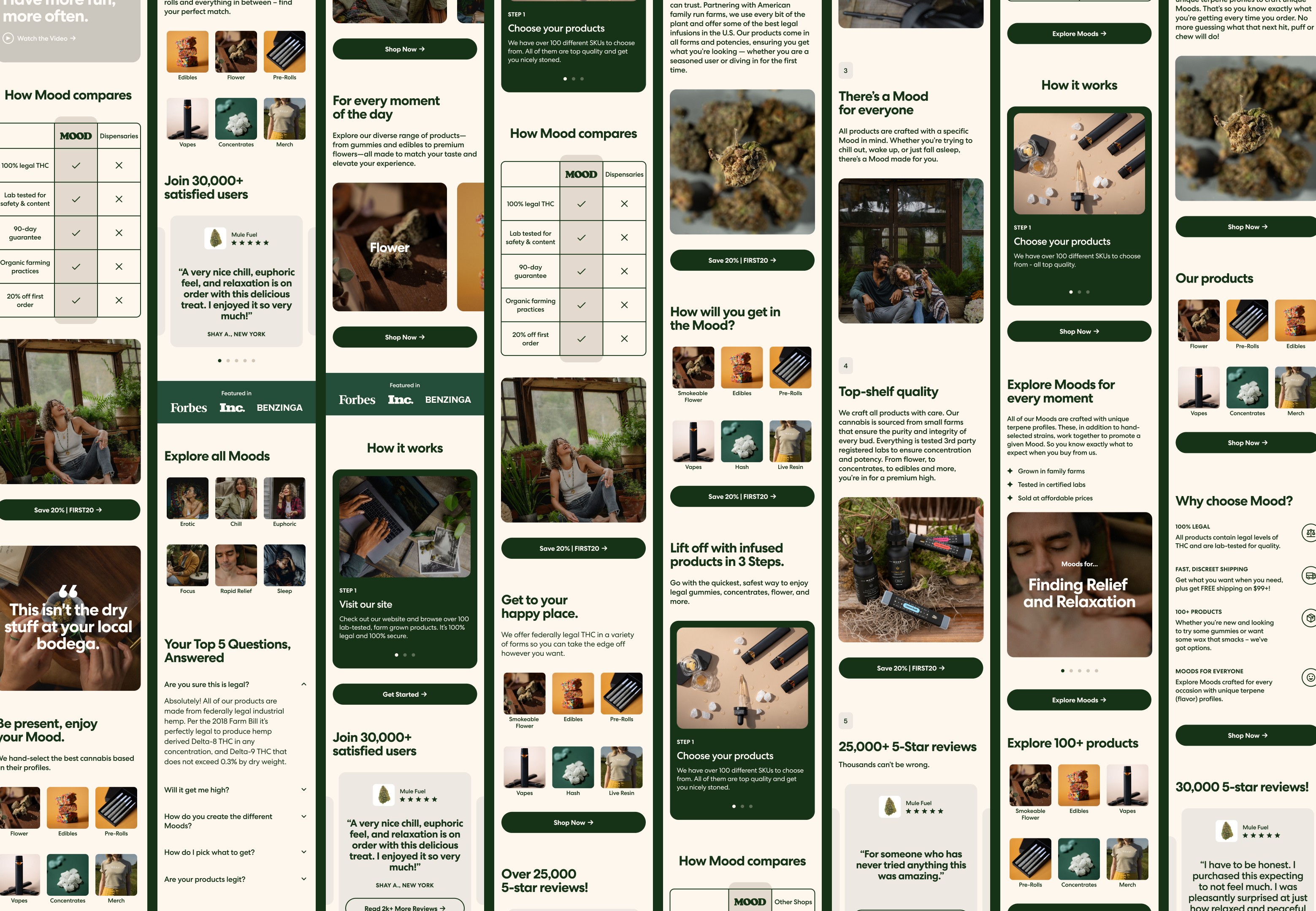
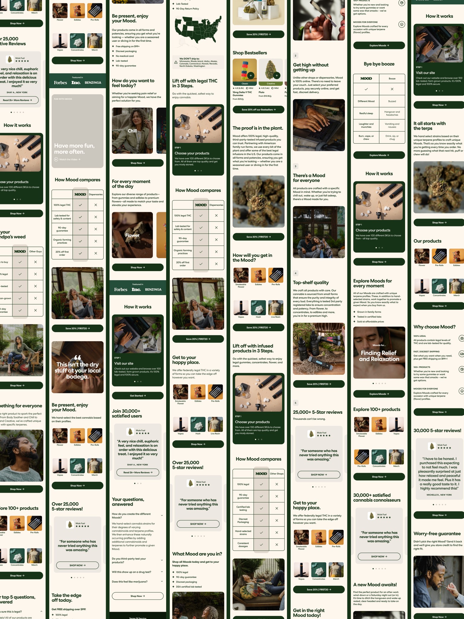

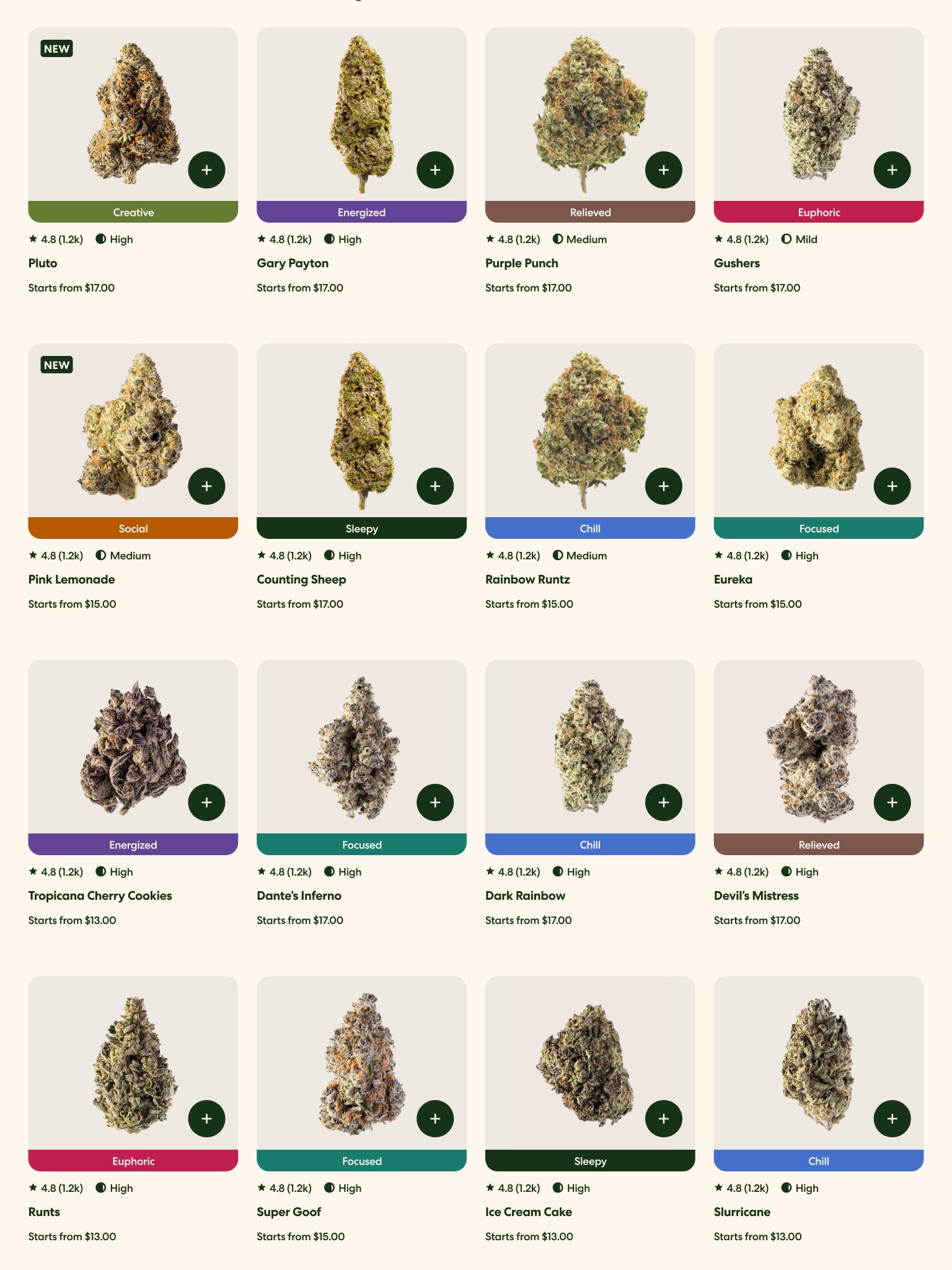
Great acquisition experiences aren't discovered. They're tested, refined, and earned.

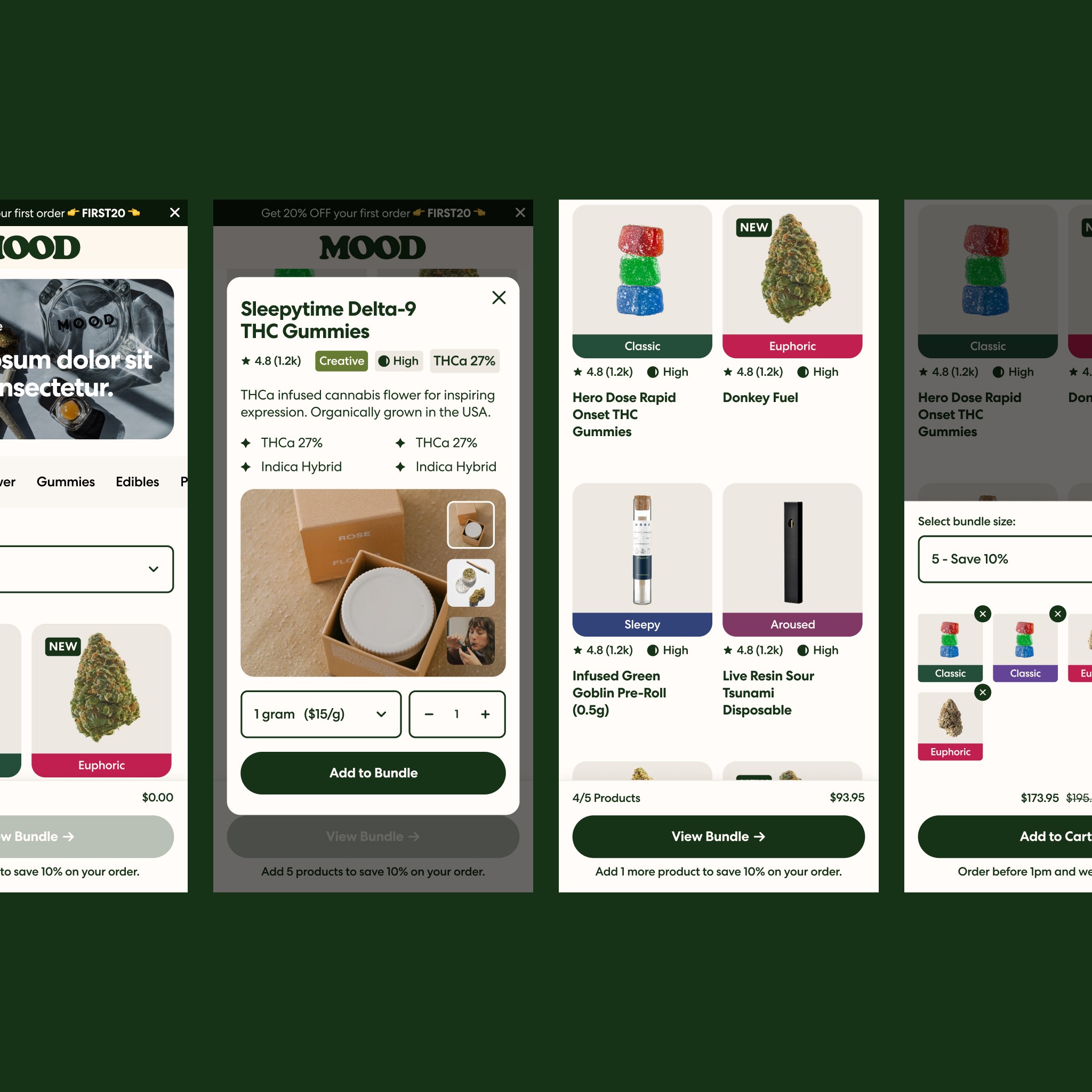
The Brief
A new brand identity needed to perform, not just look better.
Following a full website redesign, Mood needed its acquisition landing pages and product discovery experiences to reflect its updated brand.
The challenge went beyond visual consistency. Operating in a regulated cannabis market meant balancing product education, customer trust, compliance considerations, and conversion performance.
The goal was to rebuild and optimize landing pages that could communicate the brand more effectively while improving the path from paid acquisition to purchase.
The Strategy
Research first. Design quickly. Let the results decide.
The engagement began with a comprehensive review of existing landing pages, combining qualitative research, quantitative analysis, and competitive evaluation to identify opportunities for improvement.
Rather than approaching every page as a completely new design, the team worked from Mood's existing UI system in Figma, maintaining brand consistency while accelerating production.
The strategy also emphasized continuity between acquisition creative and the landing page experience. Customers arriving from an advertisement needed to encounter familiar messaging, imagery, and product information rather than an abrupt change in direction.
Each experience could then be evaluated through A/B testing, allowing performance data to inform subsequent iterations.
The Decisions
Move fast without making everything disposable.
One of the biggest design challenges was balancing the speed of experimentation with the need for consistent, high-quality experiences.
With more than ten landing pages to deliver in a compressed timeline, rebuilding every interface from scratch would have introduced unnecessary production overhead.
Using established components and visual patterns allowed the team to concentrate on the elements that mattered most to each experiment, including content hierarchy, product presentation, and conversion-focused interactions.
The technical environment introduced another constraint. Mood's landing pages operated outside its primary Shopify instance, requiring the team to adapt to a separate implementation workflow and the client's preferred tools, including PostHog.
Rather than designing around an idealized platform, the work needed to account for the actual environment in which experiments would be launched and measured.
The Build
A steady pipeline of pages, experiments, and iteration.
Over six months, the Prismfly team redesigned existing acquisition experiences and developed new landing pages aligned with Mood's refreshed identity.
The work brought together design, copywriting, development, and Mood's internal stakeholders, with frequent testing cycles requiring close coordination and fast turnaround.
Designs were developed in Figma using established UI patterns, then translated into landing page experiences that could be tested through the client's experimentation workflow.
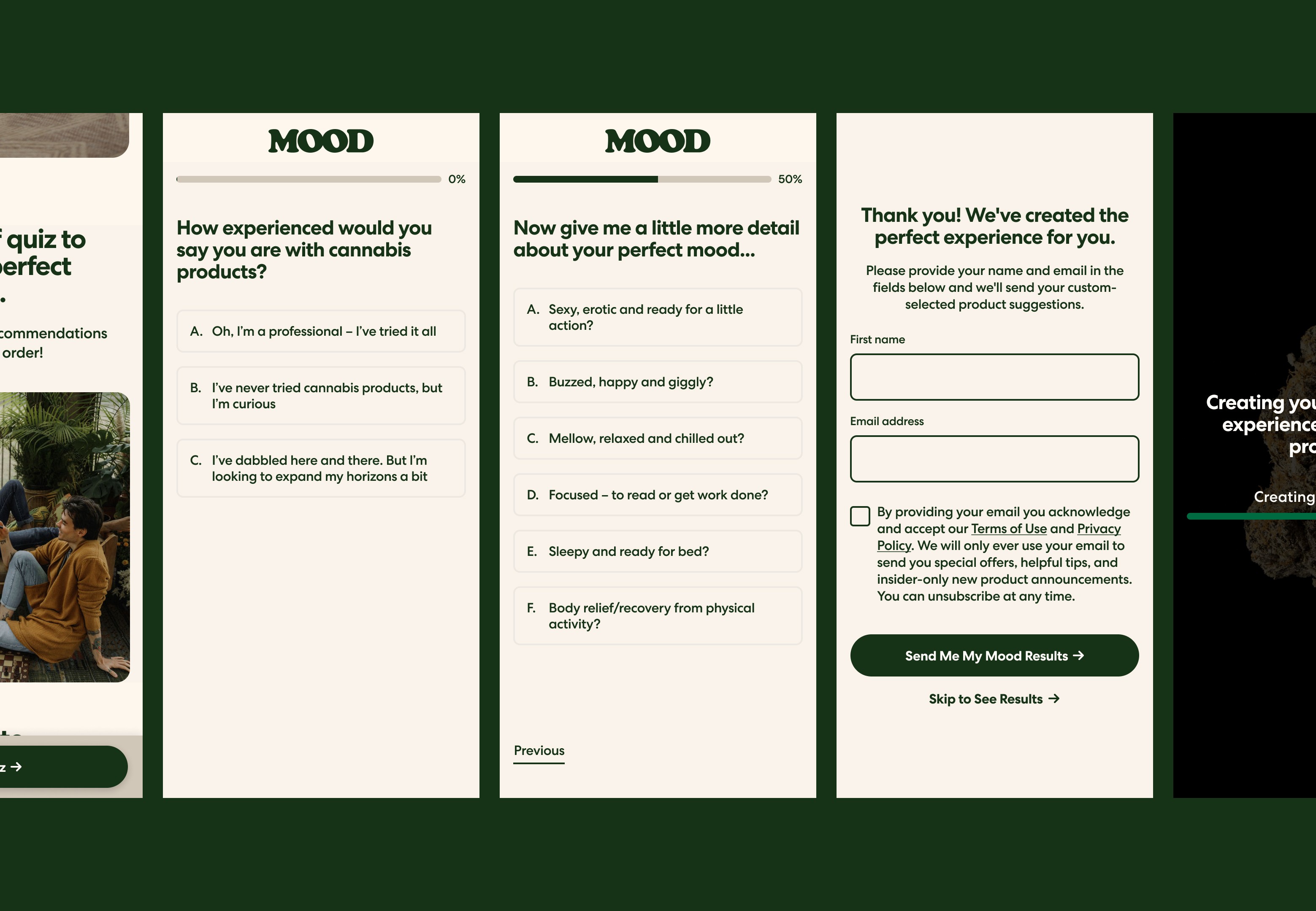
The engagement also included refreshing Mood's quiz experience to better align with the updated brand.
Across the program, the focus remained on producing consistent, conversion-oriented experiences without sacrificing the speed required for ongoing experimentation.
The Impact
78.6% of landing page tests improved purchase conversion.
The experimentation program achieved a 78.6% purchase win rate across the launched landing page tests.
Individual results varied, but repeated improvements demonstrated the value of combining research, conversion-focused UX, and rapid iteration.
The team delivered more than ten new or reworked pages while maintaining alignment with Mood's evolving brand and navigating the constraints of its technical environment.
The engagement demonstrated that fast-moving acquisition design could remain consistent, measurable, and commercially effective.
The Reflection
Good design makes room for being wrong.
What makes experimentation interesting is that the most visually compelling solution isn't always the one that performs best.
Working within a rapid testing program means balancing design judgment with evidence, adapting to technical limitations, and accepting that customer behavior can challenge your assumptions.
Mood is a strong example of why I value the intersection of design and performance. The goal isn't to defend every creative decision. It's to keep making better ones.
Full Credits
Initial Design System
Gander Agency
Photography
Mood Partner Photographer
Design Strategy Lead
Martick
CRO & Design Support
Prismfly
WHAT'S NEXT
There's more where that came from.
One project only tells part of the story. Explore more of my work, the teams I've led, and the experiences that shaped how I approach design.
MORE WORK
Different challenges, different industries, same obsession with making things better.
EXPERIENCES
A closer look at my background across technical design, brand-building, creative leadership, digital systems, and hands-on execution over the last few years.